3 Directed Acyclic Graphs and Causal Reasoning
3.1 Peering into a black box
To better understand the relationship between data and statistical analysis on the one hand and DAGs (directed acyclic graphs) on the other hand, I came up with an electric engineering metaphor3. Imagine that you have an electric device that you cannot take apart. However, there are certain points where you can connect your multimeter and check whether current flows between these two points. You also have a schematics for the device but you have no idea whether it is accurate. The names of the connector nodes match but the connectivity between them is anybody’s guess. So, what do you do? You look at the schematics and identify two nodes where current should definitely flow and you measure whether that is the case. Do you have signal? Good, that means that at least with respect to the connectivity between these two nodes you schematics is not completely wrong. No signal? Sorry, your schematics is no good, find a different one or try making one yourself. Conversely, you can identify two nodes, so that no current should flow between them and measure it empirically. No current? Good! Current? Bad, your schematics is wrong.
The relationship between the device and the schematics is that of the large (device) and small (schematics) world. Your job is to iteratively adjust the latter, so that it matches the former. You need to keep prodding the black box until predictions from your schematics start matching the actual readings. Only then you can say that you understand how device works and you can make predictions about what it will do under different conditions. Although testing based on schematics can be automated, generating such schematics is a creating process. It depends on our knowledge about devices of that kind and about individual exposed nodes.
Hopefully, you can see how it maps on our observational or experimental data (large world, readings from the device) and DAGs (small world, presumed schematics). As a scientist, you guess4 the causal relationships between individual variables and you draw a schematics for that (a DAG). Using this DAG, you identify pairs of variables that must be dependent or independent assuming your DAG is correct and check the data on whether this is indeed the case. It is? Good, your DAG is not (entirely) wrong! They are not? Bad news, their causal relationship is different from what you (or others in prior work) came up with. You need to modify DAG or draw a completely different one, just like a engineer must modify the schematics.
Note that this process is the opposite to that in a typical multivariate analysis approach using, say, ANOVA. In the latter case, you throw everything together, including some/all interactions between the terms, and try figuring out causal relationship between individual independent and the dependent variable based on magnitude and significance of individual terms. So, first you run the statistical analysis and then you make your inferences about causal relationships. In causal reasoning using DAG, you first formulate causal relationships and then you use statistical analysis to check whether these relationship are correct. The second approach is much more powerful, because you can run ANOVA only once but you can formulate many DAGs that describe your data and test them iteratively, refining your understanding step-by-step. Moreover, ANOVA (or any other regression model like that) is about identifying relationships between invididual independent and the signle dependent variable (individual coefficients tell you how independent variables can be used to predict the dependent). DAG-based analysis allows you to predict and test relationship between pairs of dependent variables as well, decomposing your complex model into testable and verifyable chunks. It is a more involved and time-consuming approach but it gives you much deeper understanding of the process you are styding compared to “throw everything into ANOVA and hope it will magically figure it out”.
Moreover, causal calculus via DAGs has another trick up its sleeve. You can use conditional probabilities (see below) to flip the relationship between variables. If two variables are independent, they may be dependent when conditioned on some third variable. Or vice versa, depedent variables can become conditionally independent. This means that your predictions about connectivity between pairs of variables can be both more specific (e.g., they are related via a third variable or they both independently cause that third variable) and more testable, as you now have two opposite predictions for the same pair of variables! You can check that current flows when it should (unconditional probability) and does not flow once you condition it on the third variable. Both tests match? DAG is not that bad! One or none match? Back to the drawing board!
3.2 Turning unconditional dependence into conditional independence
Below, you will see how multiple regression can show conditional independence of two variable in case of the fork DAG in divorce data. However, there is another more general way to understand this concept it terms of conditional probabilities \(Pr(M|A)\) and \(Pr(D|A)\). For this, it helps to understand condition probabilities as filtering operation. When we compute conditional probability for a specific value of \(A\), this means that we slice the data, keeping only whose values of \(M\) and \(D\) that correspond to that chosen level of \(A\). It is easier to understand, if we visualize that conditional-probability-as-filtering in synthetic data. For illustration purposes, I will synthesize divorce data, keeping the relationships but I will space marriage age linearly and generate the data so that there are 20 data points for each age (makes it easier to see and understand).
set.seed(84321169)
N <- 180
sigma_noise <- 0.5
# we repeat each value of age 10 times to make filtering operation easier to see
sim_waffles <- tibble(MedianAgeMarriage = rep(seq(-2, 2, length.out=9), 20),
                      Divorce = rnorm(N, MedianAgeMarriage, sigma_noise),
                      Marriage = -rnorm(N, MedianAgeMarriage, sigma_noise))

MD_plot <-
  ggplot(data=sim_waffles, aes(x=Marriage, y=Divorce)) +
    geom_smooth(method="lm", formula=y~x) +
    geom_point() +
    xlab("Marriage rate") +
    ylab("Divorce rate")

AD_plot <-
  ggplot(data=sim_waffles, aes(x=MedianAgeMarriage, y=Divorce)) +
    geom_smooth(method="lm", formula=y~x) +
    geom_point() +
    xlab("Median age marriage") +
    ylab("Divorce rate")

AM_plot <-
  ggplot(data=sim_waffles, aes(x=MedianAgeMarriage, y=Marriage)) +
    geom_smooth(method="lm", formula=y~x) +
    geom_point() +
    xlab("Median age marriage") +
    ylab("Marriage rate")

MD_plot | AD_plot | AM_plot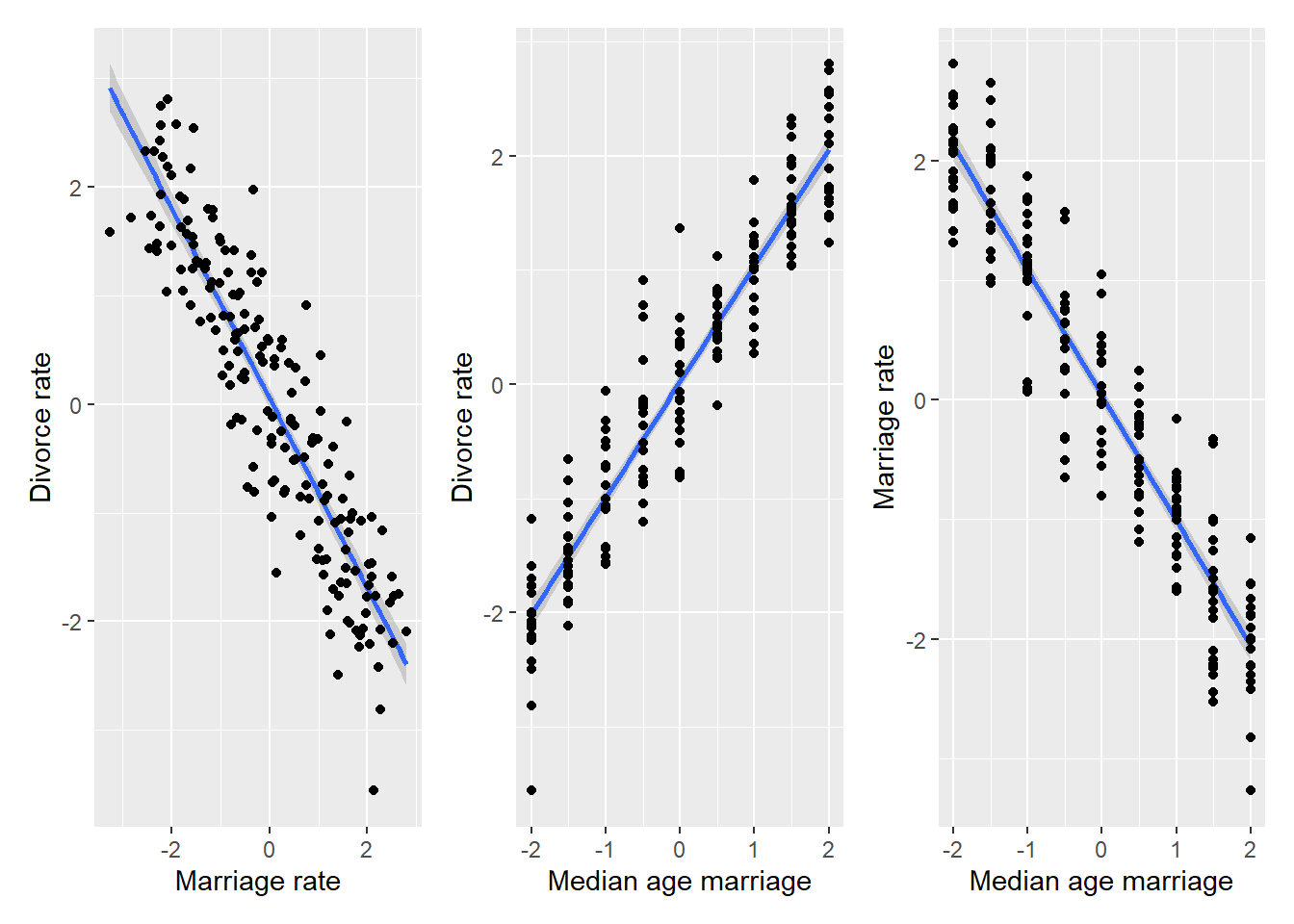
As you can see, all variables being dependent on each other, as in case of the original data. However, let us pick an arbitrary value, say \(A=1\)5 and see which dots on the left plot will be selected via filtering on that value.
MD_plot <-
  ggplot(data=sim_waffles, aes(x=Marriage, y=Divorce)) +
    geom_smooth(method="lm", formula=y~x, alpha=0.1) +
    geom_point(data=sim_waffles %>% filter(MedianAgeMarriage == 1), color="red") +
    geom_point(data=sim_waffles %>% filter(MedianAgeMarriage != 1), alpha=0.15) +
    xlab("Marriage rate") +
    ylab("Divorce rate")
AD_plot <-
  ggplot(data=sim_waffles, aes(x=MedianAgeMarriage, y=Divorce)) +
    geom_smooth(method="lm", formula=y~x) +
    geom_point(data=sim_waffles %>% filter(MedianAgeMarriage == 1), color="red") +
    geom_point(data=sim_waffles %>% filter(MedianAgeMarriage != 1), alpha=0.15) +
    xlab("Median age marriage") +
    ylab("Divorce rate")

AM_plot <-
  ggplot(data=sim_waffles, aes(x=Marriage, y=MedianAgeMarriage)) +
    geom_smooth(method="lm", formula=y~x) +
    geom_point(data=sim_waffles %>% filter(MedianAgeMarriage == 1), color="red") +
    geom_point(data=sim_waffles %>% filter(MedianAgeMarriage != 1), alpha=0.15) +
    ylab("Median age marriage") +
    xlab("Marriage rate")

MD_A1_plot <-
  ggplot(data=sim_waffles %>% filter(MedianAgeMarriage == 1),
         aes(x=Marriage, y=Divorce)) +
    geom_smooth(method="lm", formula=y~x, color="red") +
    geom_point(color="red") +
    xlab("Marriage rate") +
    ylab("Divorce rate") +
    labs(subtitle = "Pr( |Mariage Age = 1)")

(AD_plot | MD_plot) /
(MD_A1_plot |AM_plot)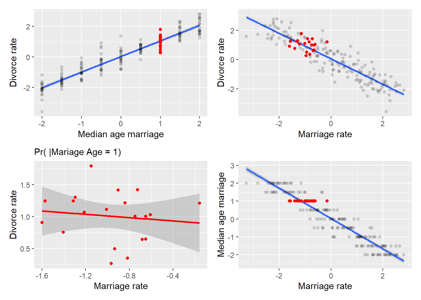
First, take at top-left and bottom-right plots that plot, correspondingly, divorce and marriage rate versus marriage age. Note that I’ve flipped axes on the bottom-right plot, so that marriage rate is always mapped on x-axis. The red dots in each plot correspond to divorce and marriage rates given that (filtered on) marriage age is 1. The same dots are marked in red in the top-right plot and are plotted separately at the bottom-right. As you can see, the two variables conditional on A=1 are uncorrelated. Why? Because both were fully determined by marriage age and any variation (the spread of red dots vertically or horizontally in the top-left and bottom-right plots) was due to noise. Therefore, the plot on the bottom-left effectively plots noise in marriage rate versus noise in divorce rate and, by our synthetic data design, the noise in two variable was independent, hence, lack of correlation.
This opportunity to turn dependence into independence by conditioning two variables on the third is at the heart of causal reasoning6. You draw a DAG and if it has a fork in it, you know that given your educated guess about causal relationship is correct (small world!), your data (large world!) should show dependence and conditional independence of the two variables (divorce and marriage rates). What if it does not? E.g., the two variables are always dependent or always independent, conditional or not? As we already discussed above, that just means that your educated guess was wrong and that relationship of the variables is different from how you thought it is. Thus, you need to go back to the drawing board, come up with another DAG, repeat the analysis and see if that new DAG is supported by data. If you have more variables, your DAGs will be more complex but the beauty of such causal reasoning is that you can concentrate on parts of it, picking three variables and seeing whether your guess about these three variables was correct. This way, you can tinker with your causal model part-by-part, instead of hoping that you got everything right on the very first attempt.